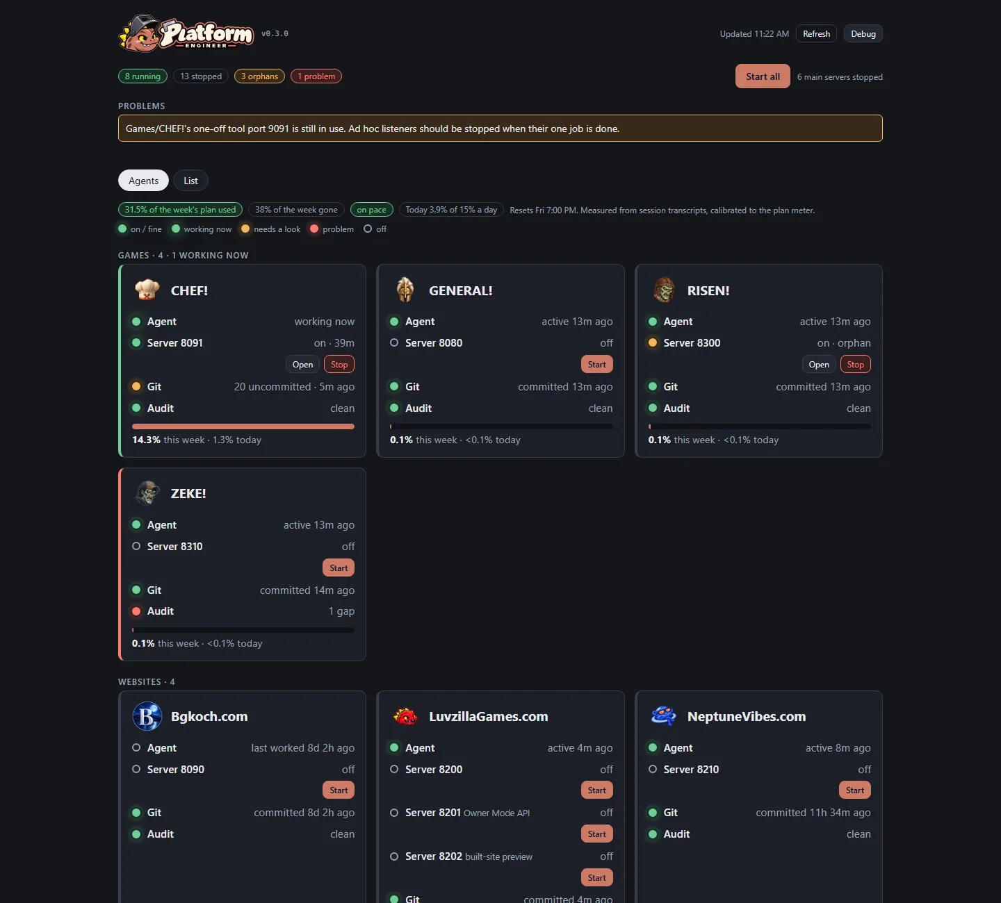
The owner asked for Control Room to be easier to read at a glance. Its first screen is now a grid with one card per agent (every game, website, tool and role), wearing that agent's own icon, grouped by kind.
Each card lights up part by part: whether the agent is working right now, each of its servers, whether its work is committed, and whether the hourly audit found anything. Green is fine, pulsing green is working now, amber needs a look, red is a problem, and a hollow ring is off. Every light also says its state in words, so colour is never the only signal.
Servers start and stop right from the card, and a bar shows the agent's share of the week's AI plan.
The previous table layout is still there, one tab over, for detail.

 Platform Engineer