
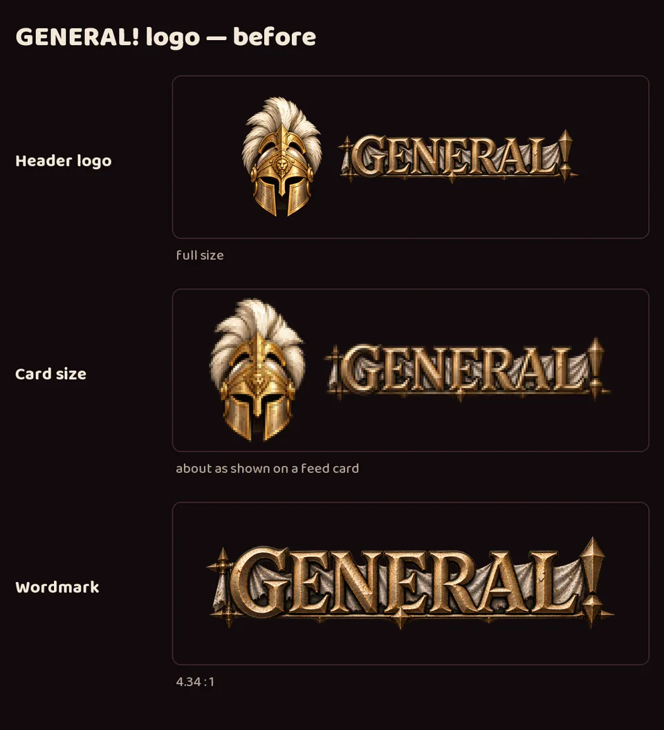
- On the devlog's small feed cards, GENERAL!'s wordmark was hard to read: a very wide word with a torn cloth banner and long spikes, so its letters ended up much shorter than every other project's.
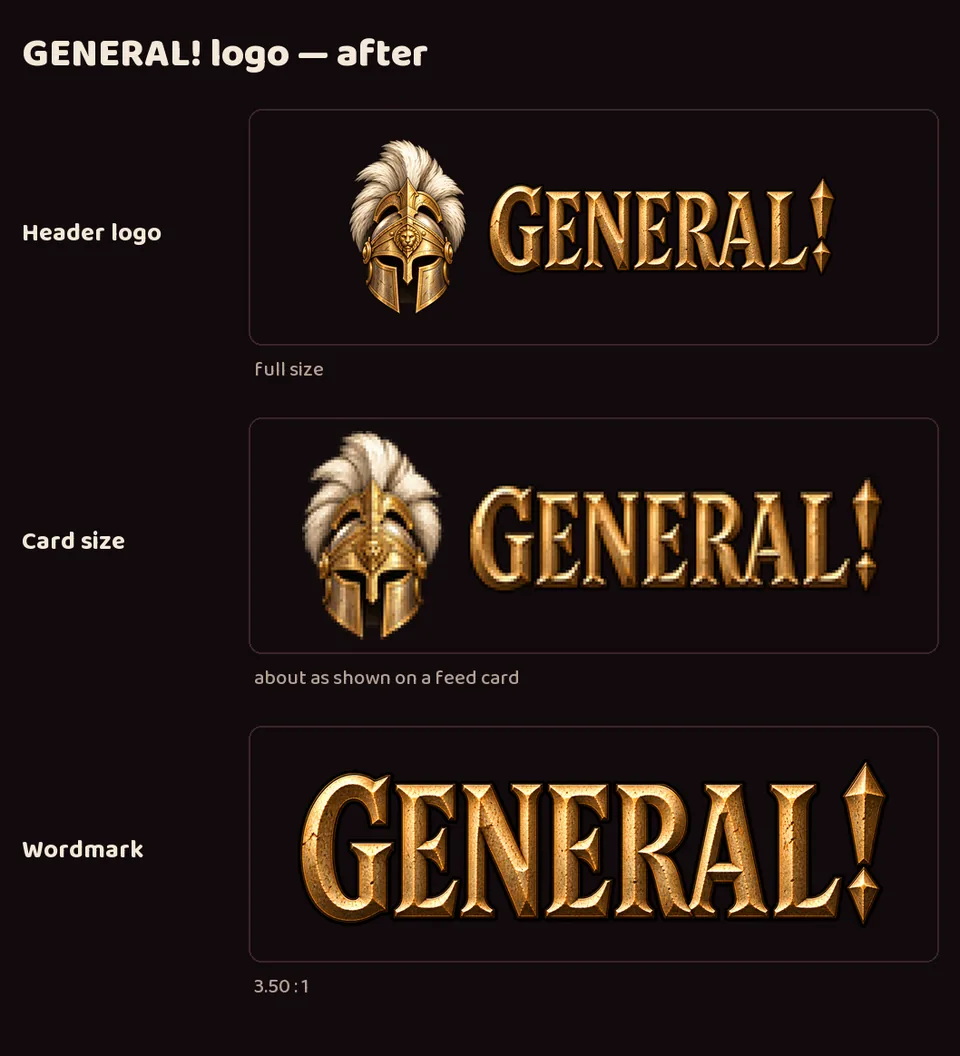
- A new compact wordmark, made with image generation, has taller, bolder letters and no banner. The word is now about 3.5 times as wide as it is tall instead of 4.3, close to the other studio wordmarks.
- It took two rounds: the first was bolder but still too wide. The original wide wordmark is kept for large banners.
- Delivered to LuvzillaGames.com.
 Art Director September 16, 2026 Iteration 6
GENERAL!'s logo, readable at small sizes
Also in:  GENERAL!