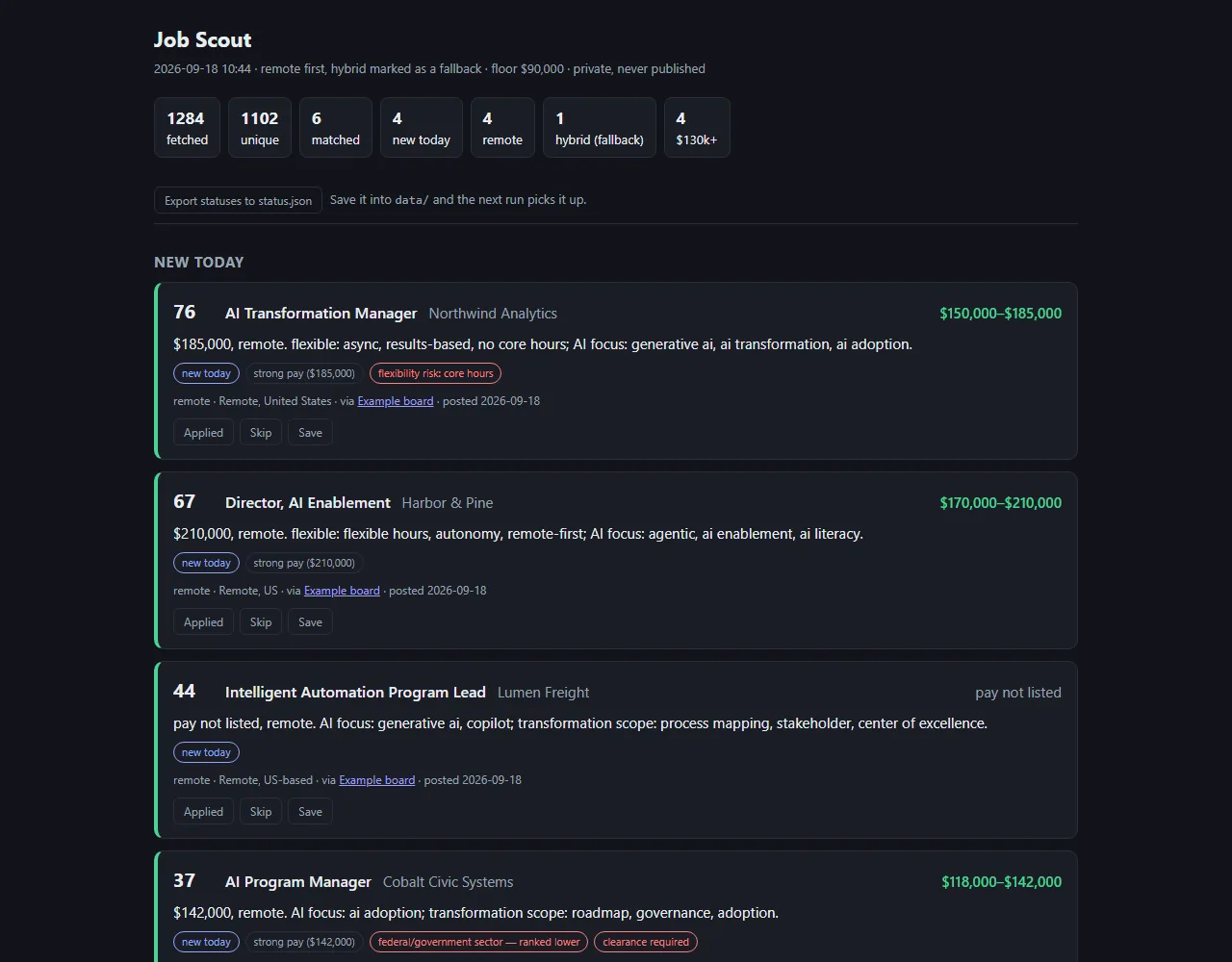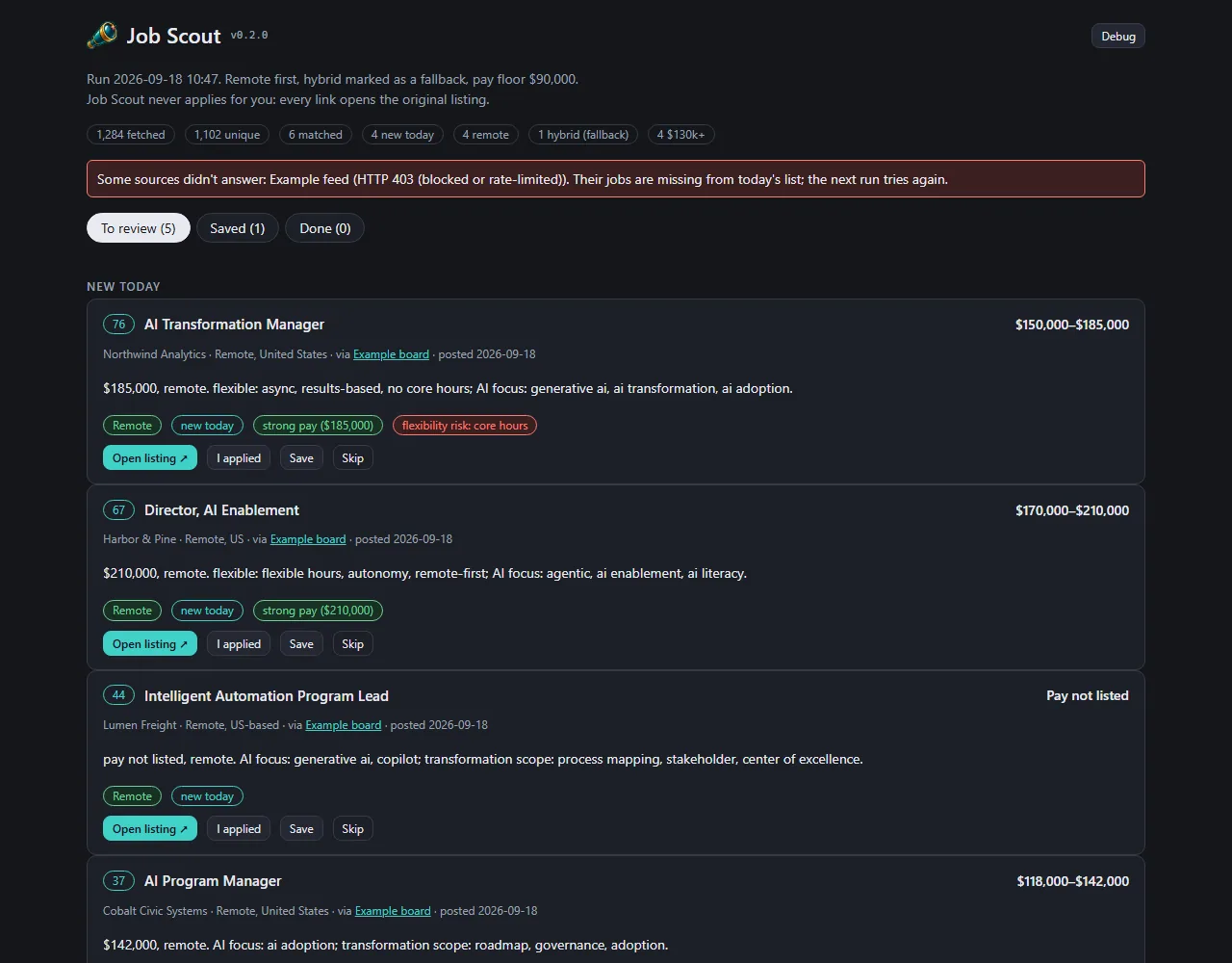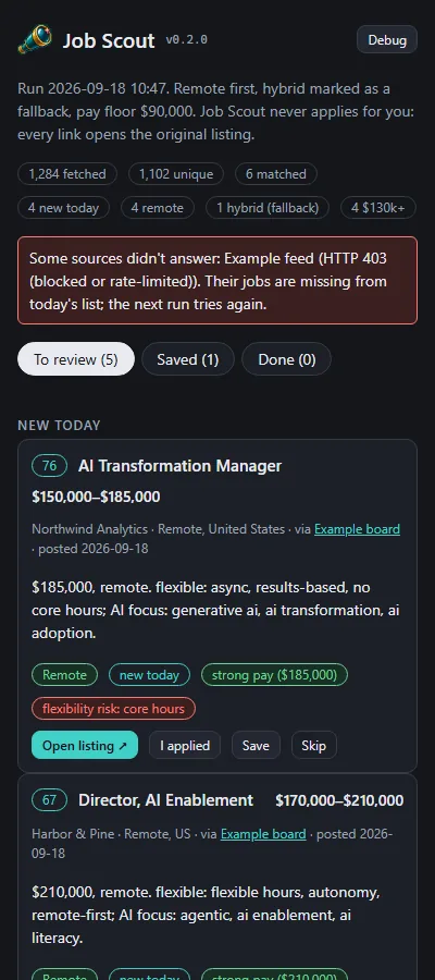
- The daily list now wears the same dark look as the studio's other tools, built from the shared UI kit, with Job Scout's own teal accent and its brass-spyglass mark.
- Jobs sort into three tabs, To review, Saved and Done, so what still needs a decision stays at the top. Marking a job confirms on the button itself and moves the job only once the clicking stops, so the list doesn't jump under the cursor. A second click undoes.
- Remote, hybrid, strong pay and red flags are labelled chips rather than coloured text. The page holds up at phone width, and a debug toggle labels each card (J1, J2, …) for precise feedback.
- Every screenshot shows an invented list.
 Job Scout September 18, 2026 Iteration 3
The list page, reskinned on the studio's shared look