 Art Director
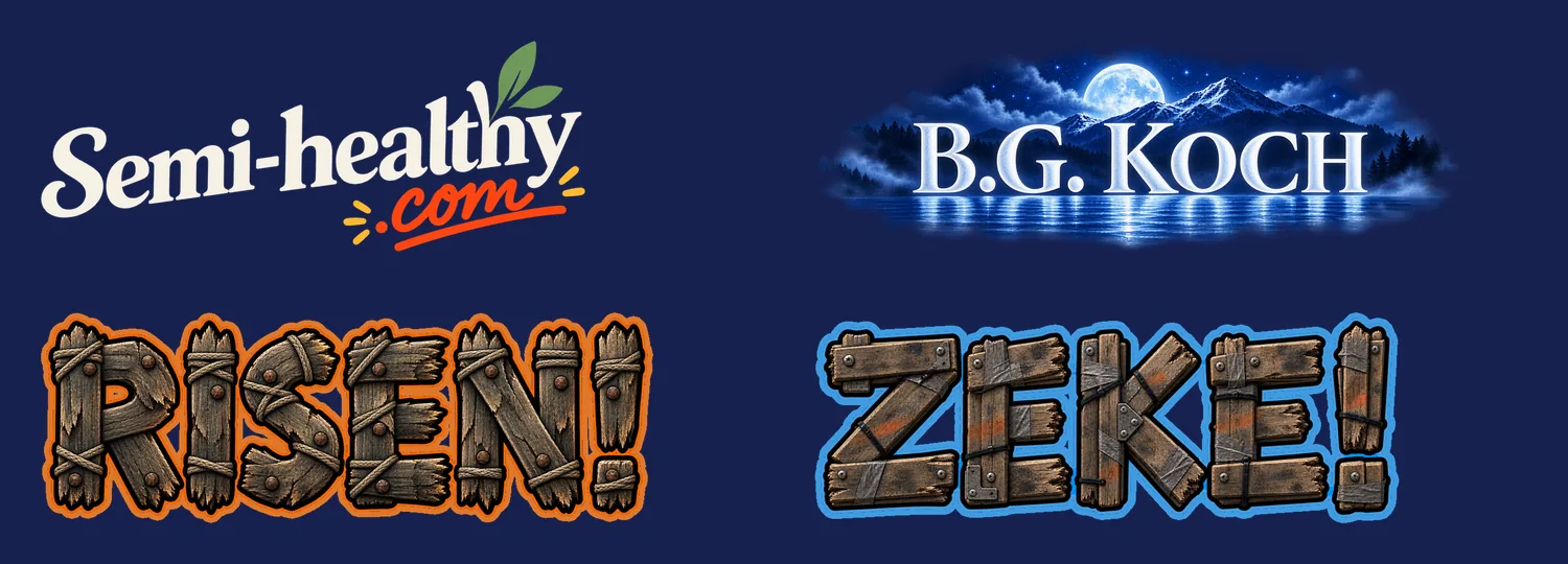
- NeptuneVibes.com's home page now shows each project's wordmark on a navy tile. Four were too dark to read there.
- Semi-healthy.com's dark-green lettering is now the brand's cream. RISEN! and ZEKE! keep their wooden letters untouched, each wrapped in a thick outline of its own colour, ember orange and electric blue.
- B.G. Koch got a new wordmark, painted like the book cover: frosted letters in a moonlit lake scene that fades into the page. A plainer serif version came first, and the Owner turned it down for being dull.
Wordmarks that read on the site's navy
Also in:  NeptuneVibes.com
 Semi-healthy.com
 Bgkoch.com
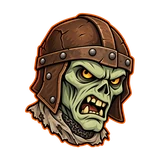 RISEN!
 ZEKE!