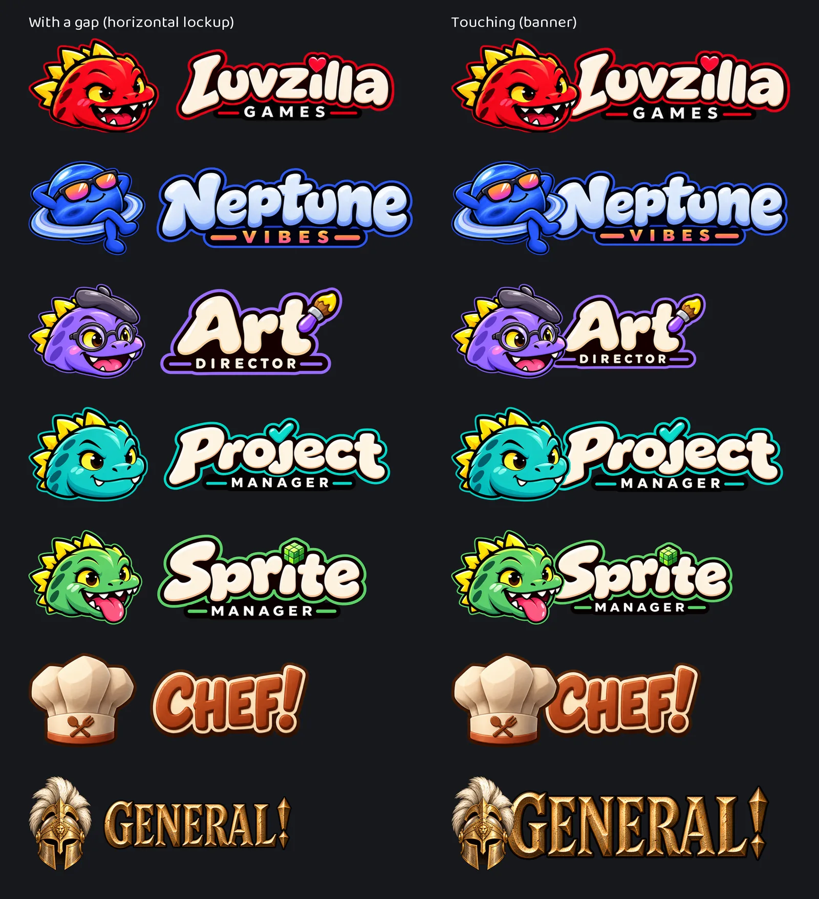
- Until now each brand had one way to put its character beside its name: side by side, with a clear gap. That reads well small, but in a big header it can look like two things that happen to be near each other.
- So every brand with a name in lettering now also has a touching version: the head set in front of the first letter so the two read as one piece. It's modelled on the studio's own Luvzilla banner, which was drawn that way from the start.
- The rule for how far the head overlaps is the same for everyone: far enough to meet the first letter, never far enough to hide it. Each one was checked up close to make sure that letter still reads whole.
- Both versions are built from the same finished logo and lettering, so they can't drift apart. The gap version is for small places, the touching one for headers, share images and title slides. All art here comes from image generation.
 Art Director September 18, 2026 Iteration 24
Every logo now comes two ways: with a gap, and touching