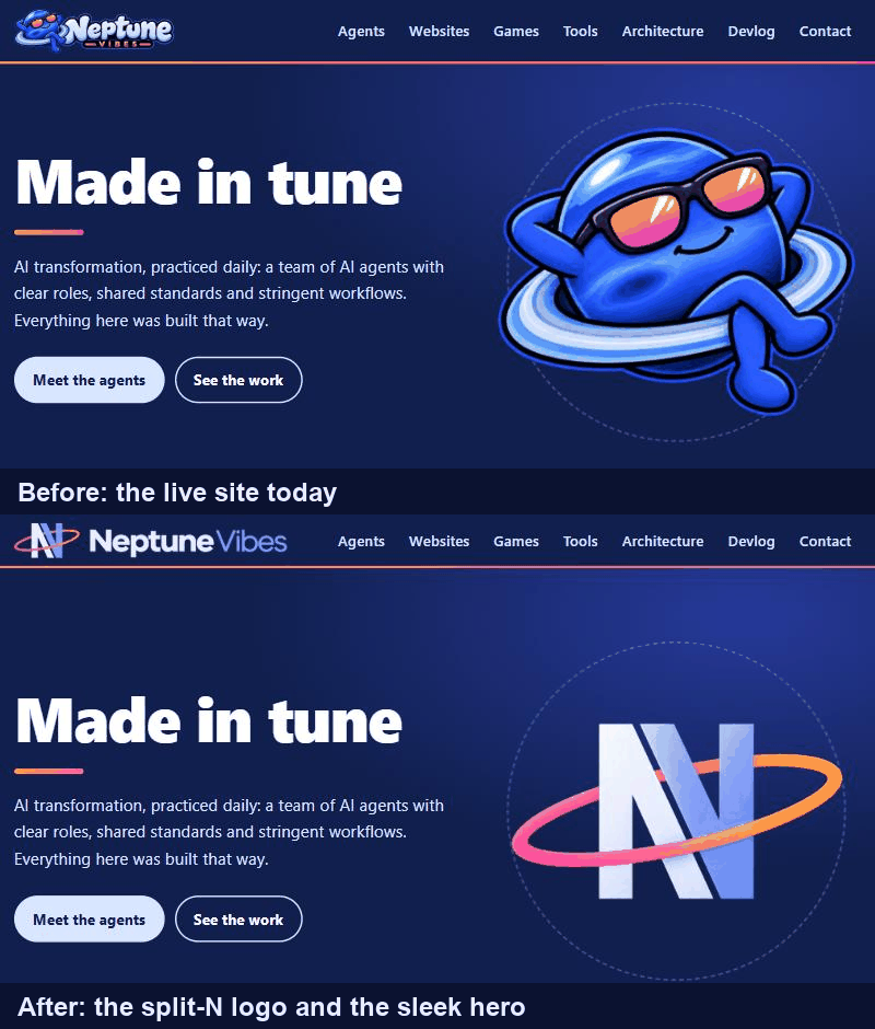
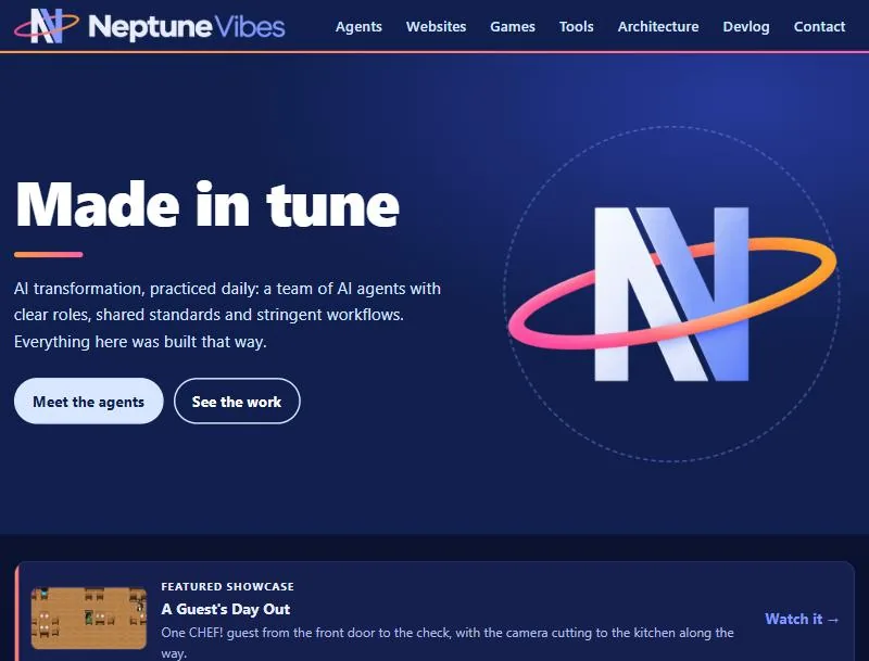
The header carries the new logo: an N split along its diagonal, with a sunset-colored ring around it, beside "Neptune Vibes" in near-white and light blue. It replaces the cartoon Neptune.
The home page's big picture is the same N, drawn as a sleek illustration with soft gradients and a glowing ring, inside the dashed orbit. It took three rounds to choose: a flat version, a solid 3D one, and this one in between.
The browser-tab icon, the home-screen icons and the picture a shared link shows all use the new mark. The tab icons are solid navy tiles now, so they read on light and dark browser tabs.
The banner is wider and shorter than the old one, and the N in it was made smaller so it doesn't outweigh the name. The header sizes it to the same width the old one took, so the menu stays on one line on a desktop and fits below it on a phone.
 NeptuneVibes.com