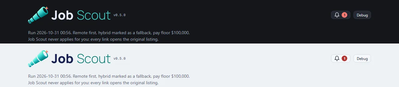
Job Scout wears the Art Director's new brand: the mark and favicons in Neptune's sleek finish, and the name typeset in the studio's shared wordmark font, so it matches every other tool side by side.
The header switches banners with the theme: the standard banner on dark pages, a light version with a navy "Job" on light pages, through the shared UI kit's banner pair.
The showcase video was re-recorded with the new look: the whole run on made-up data, from the day's list through triage votes to a built résumé.

 Job Scout