 Art Director
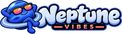
- NeptuneVibes.com's logo moved from the cartoon planet to a sleek split "N" with a ring around it, in navy and blue with a sunset glint.
- Four pilots came first, then variants of the chosen one. Construction diagrams centred the ring on the N.
- It comes in two colourways, dark for the site and light for white pages, with favicons on rounded navy tiles. A 300×300 version followed for the LinkedIn company page.
Neptune Vibes gets a sleeker logo

Also in: 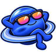 NeptuneVibes.com